Overview
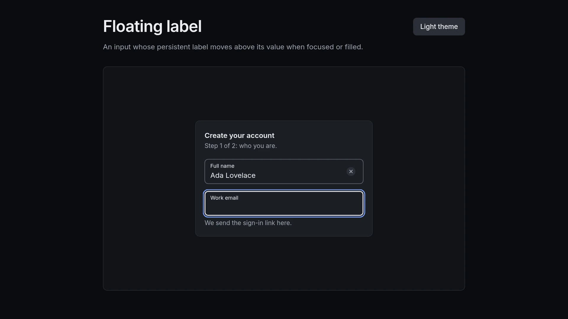
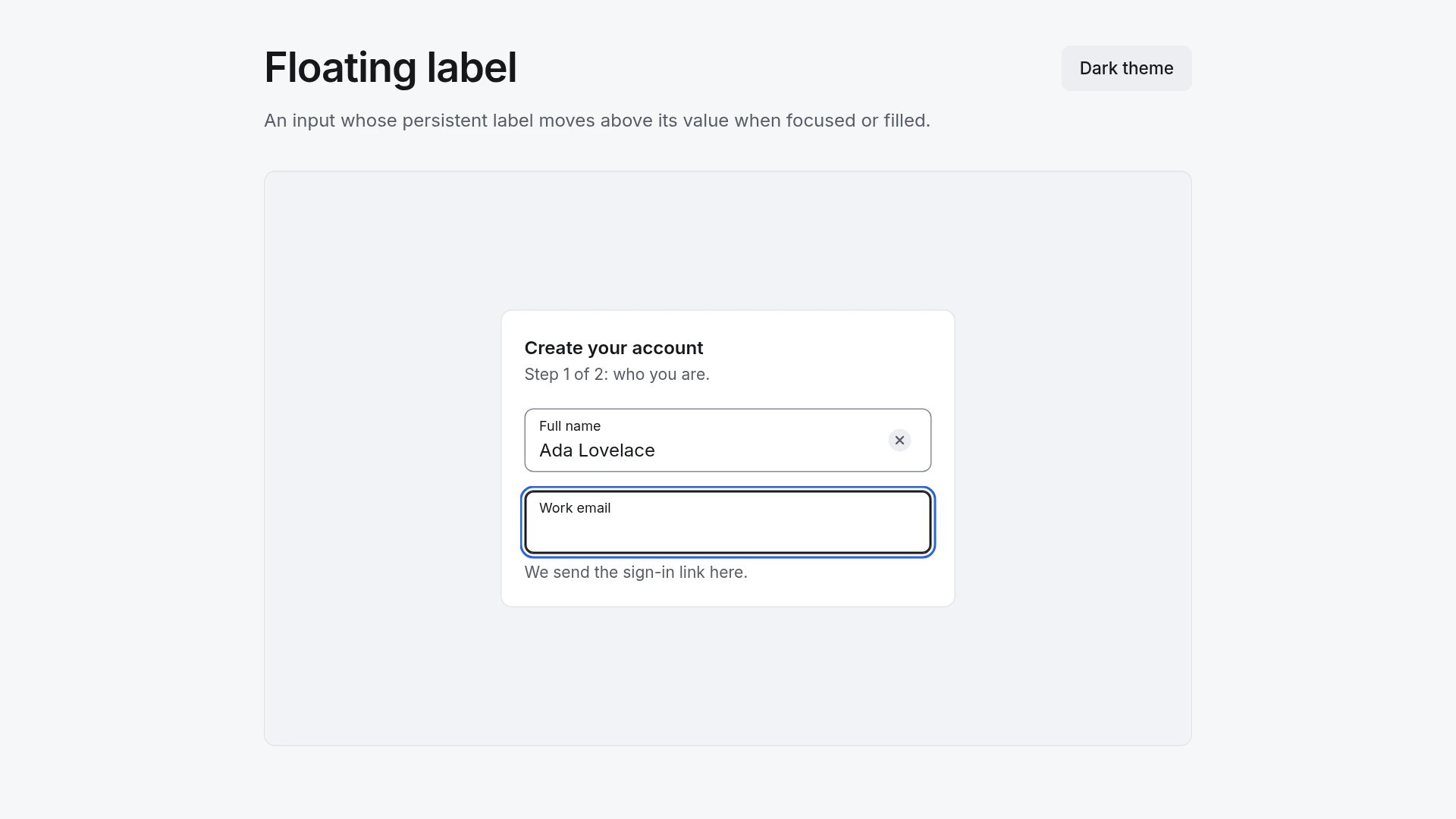
The demo is a two-field sign-up step with Full name and Work email plus a hint line. The label stays a real label, and it also rises for values filled in by the browser or set in advance. Motion: enter (label rises and shrinks, border thickens): 180 ms, cubic-bezier(0.2, 0.8, 0.2, 1); exit (label returns, only when empty and blurred): 120 ms, cubic-bezier(0.4, 0, 1, 1). The shared easing curves live in one theme file, and each duration sits right next to its transition. With reduced motion turned on, the component changes state without movement and stays fully usable. Built with React 19 and TypeScript and Tailwind CSS 4, animated with plain CSS transitions (no animation library), with keyboard and screen reader behavior from Base UI. Light and dark themes come from CSS variables you can edit. Included: the component source, the accessible behavior it is built on, light and dark theme variables, a runnable demo page, and setup guides for people and for AI coding agents.
Highlights
- Production-ready, documented source
- Clean, componentized architecture
- Drops into your stack with minimal setup