Overview
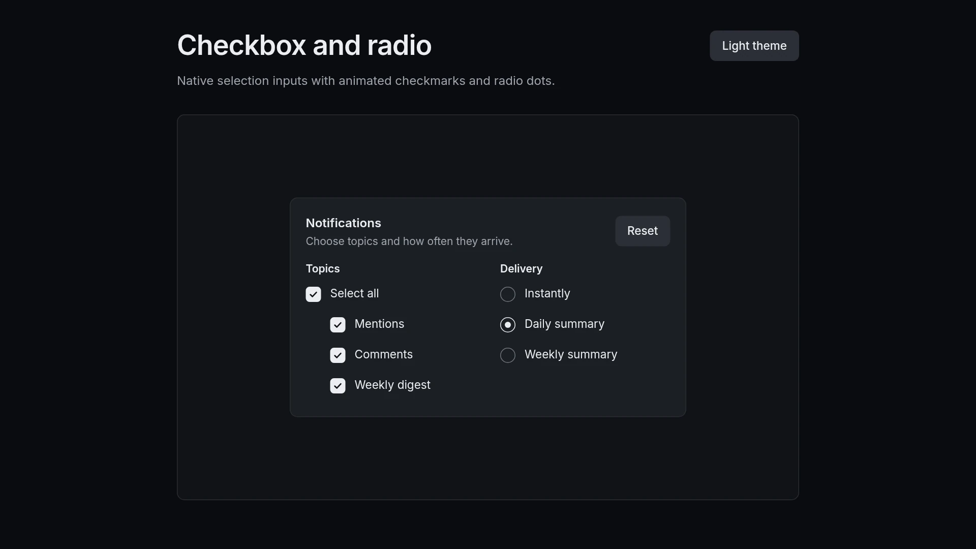
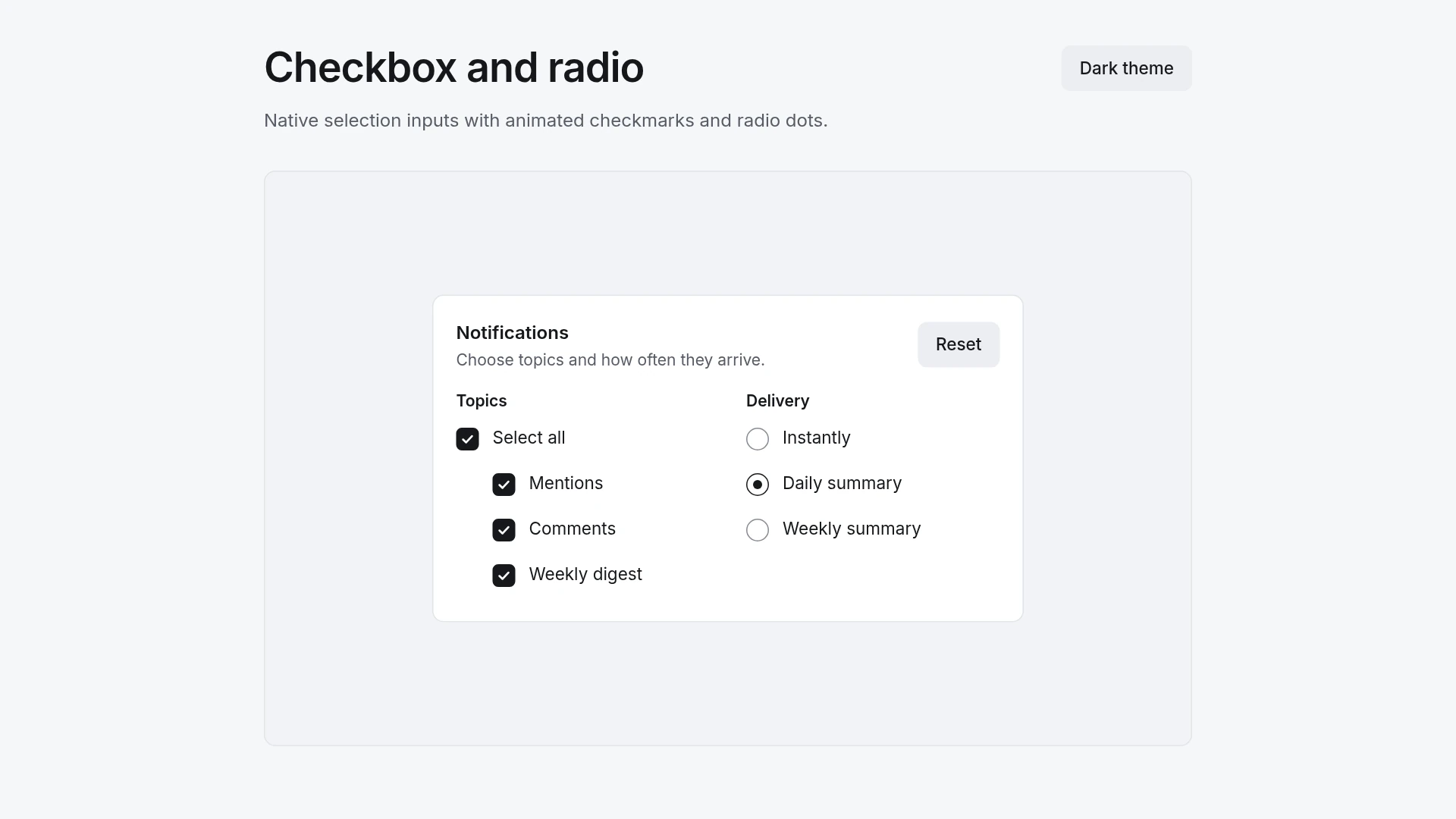
The demo is a notification settings form: topic checkboxes with a Select all box that shows a mixed state, and a radio group for how often messages arrive. They stay native inputs, so labels, forms and arrow keys work as usual. Motion: select (box fills, tick draws, dot scales 0 to 1): 180 ms, cubic-bezier(0.2, 0.8, 0.2, 1); clear (tick erases, dot scales to 0): 120 ms, cubic-bezier(0.4, 0, 1, 1). The shared easing curves live in one theme file, and each duration sits right next to its transition. With reduced motion turned on, the component changes state without movement and stays fully usable. Built with React 19 and TypeScript and Tailwind CSS 4, animated with plain CSS transitions (no animation library), with keyboard and screen reader behavior written into the component. Light and dark themes come from CSS variables you can edit. Included: the component source, light and dark theme variables, a runnable demo page, and setup guides for people and for AI coding agents.
Highlights
- Production-ready, documented source
- Clean, componentized architecture
- Drops into your stack with minimal setup