
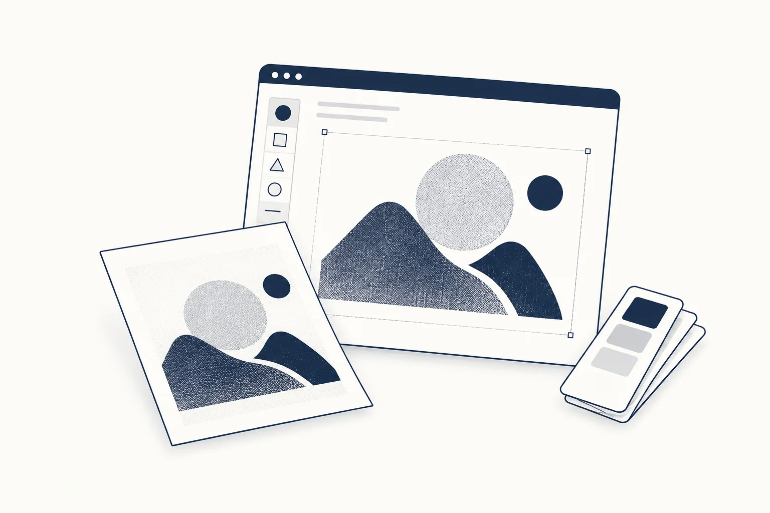
A riso-inspired web graphic is most useful as part of a repeatable editorial system: a limited palette, a recognisable treatment and a consistent relationship between subject and texture. Treat it as digital art direction, not proof that a file reproduces the behaviour of a physical print process.
The objective is a family of images that belongs together without making every article cover identical. Establish the rules, then let the subject supply the variation.
Choose the subject before the finish
For a fictional publication about independent makers, begin with a clear object or portrait for each story. Decide what someone should recognise in a small thumbnail.
A texture cannot rescue an image whose subject is unclear. Crop deliberately, simplify distracting surroundings and preserve the part of the subject that gives the article its identity. Use source material you own or have permission to use.
Limit the palette for a reason
Pick colour roles rather than an arbitrary collection of attractive swatches. One colour can establish the field, another can define the subject, and a restrained accent can mark a recurring editorial detail.
Keep those roles consistent across the series. The precise colours can vary where the publication needs variation, but the relationship should remain recognisable. Review the palette beside the actual page typography and surrounding images.
Separate texture from information
Let the texture affect the artwork, not the legibility of essential copy. Keep titles and navigation as ordinary page content rather than baking them into distressed images.
If a decorative annotation is included in the artwork, avoid inventing dates, edition numbers or production marks that could be mistaken for factual provenance. A visual convention should not create a false story about how the image was made.

Develop three crops from one direction
Prepare a wide cover, a square card and a close detail as a design exercise. Keep the subject recognisable in all three rather than mechanically cropping the same central rectangle.
HorizonX's Riso Glow resource is a place to inspect a digital treatment. Check its current controls and output options before deciding how it fits the series. Do not present a proposed sample as a completed export or print test.
Document what makes the series coherent
Record the source image, crop, palette roles and treatment decisions. That gives another designer a way to extend the system without copying one finished image repeatedly.
Browse the texture catalogue if the riso-inspired direction does not suit the subject. The right editorial system is the one that supports the stories consistently, not the one with the most obvious effect.

Is a physical print necessary?
Not for a digital editorial direction. If the project later requires print production, treat that as a separate process with its own samples and checks rather than assuming the website image proves the printed outcome.