Overview
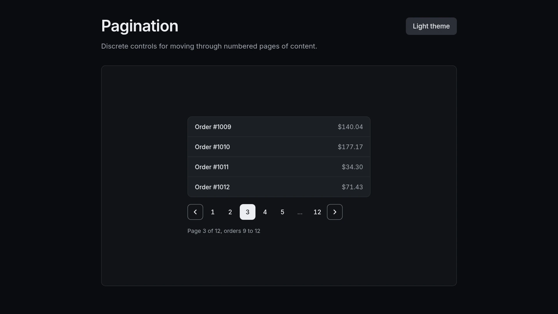
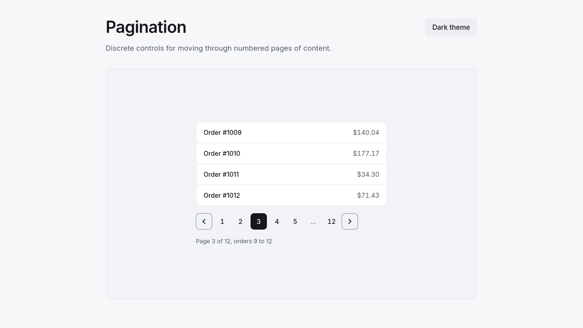
The demo pages through a list of orders with previous and next buttons, numbered pages and ellipses for long ranges. The current page is marked for screen readers, and the content moves left or right depending on the direction you go. Motion: enter: 220 ms, cubic-bezier(0.2,0.8,0.2,1); exit: 150 ms, cubic-bezier(0.4,0,1,1). Every duration and easing curve lives in one tokens file, so changing a value there changes the motion everywhere. With reduced motion turned on, the component changes state without movement and stays fully usable. Built with React 19 and TypeScript, Tailwind CSS 4 and Motion, with keyboard and screen reader behavior written into the component. Light and dark themes come from CSS variables you can edit. Included: the component source, shared motion tokens, light and dark theme variables, a runnable demo page, and setup guides for people and for AI coding agents.
Highlights
- Production-ready, documented source
- Clean, componentized architecture
- Drops into your stack with minimal setup