Overview
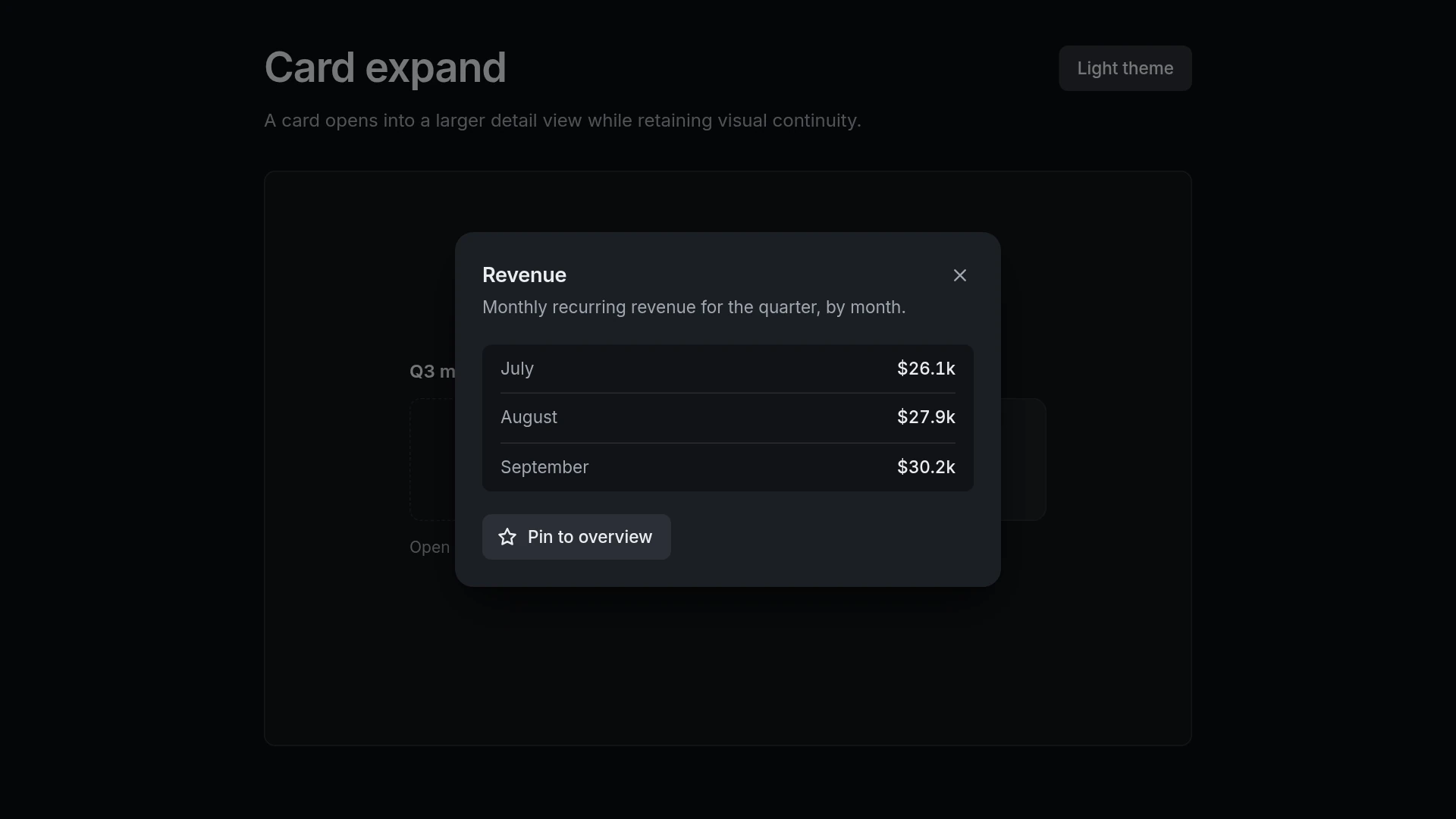
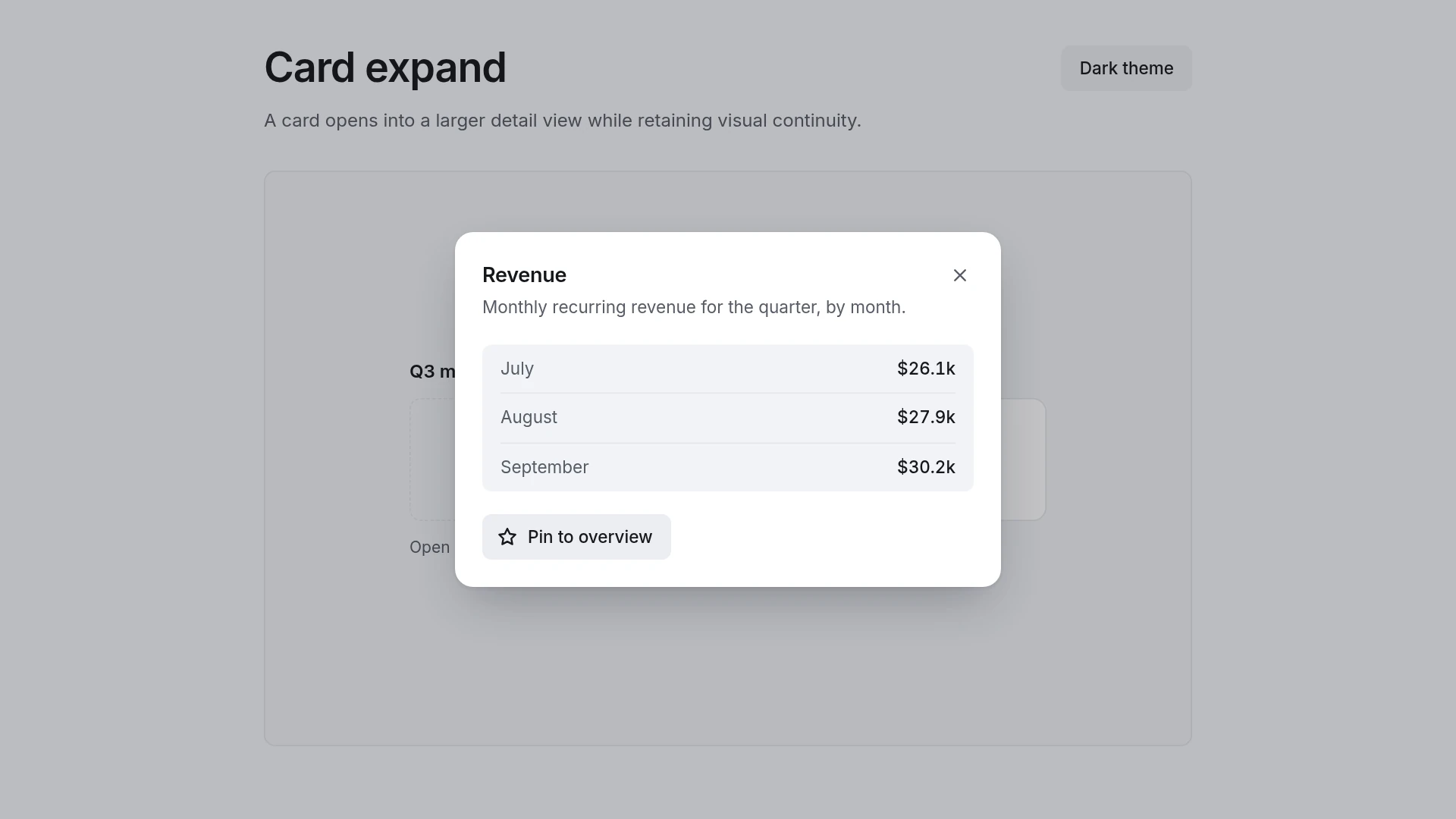
The demo is a grid of Q3 metric cards. Opening one expands it into a monthly breakdown with a pin action; focus moves into the detail view, and Escape or the close button returns it to the grid. Motion: enter (card surface grows into the dialog): 220 ms, cubic-bezier(0.2, 0.8, 0.2, 1); enter (detail content fades in, last part of the growth): 120 ms, cubic-bezier(0.2, 0.8, 0.2, 1); exit (dialog shrinks back into the card): 160 ms, cubic-bezier(0.4, 0, 1, 1). Every duration and easing curve lives in one tokens file, so changing a value there changes the motion everywhere. With reduced motion turned on, the component changes state without movement and stays fully usable. Built with React 19 and TypeScript, Tailwind CSS 4 and Motion, with keyboard and screen reader behavior from Base UI. Light and dark themes come from CSS variables you can edit. Included: the component source, the accessible behavior it is built on, shared motion tokens, light and dark theme variables, a runnable demo page, and setup guides for people and for AI coding agents.
Highlights
- Production-ready, documented source
- Clean, componentized architecture
- Drops into your stack with minimal setup