Generate Button — Buttons | HorizonX

Generate Button

New

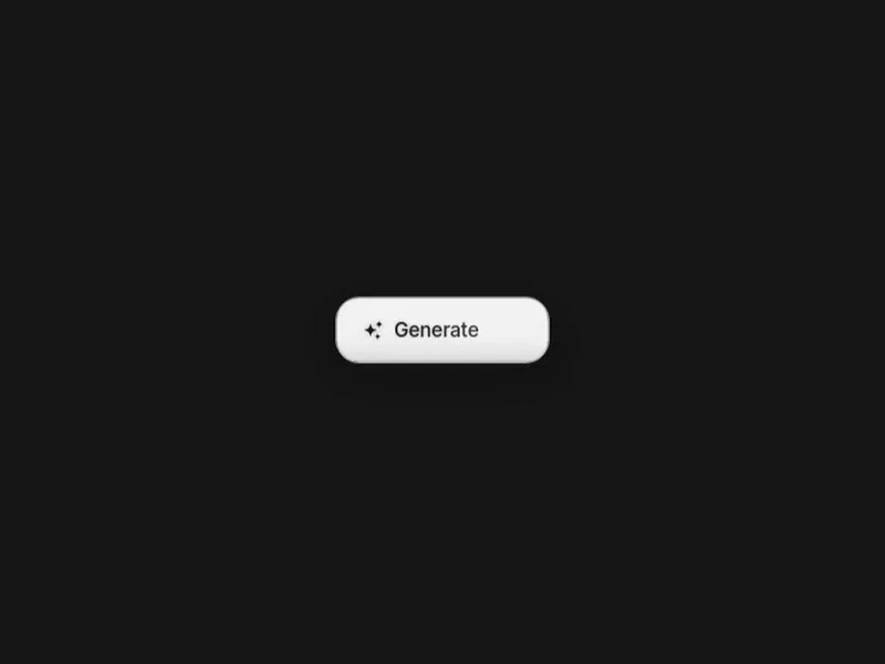
A glossy dark action button that blooms blue and changes from Generate to Generating on focus.

HorizonX · UI/UX
  • Instant access Unlocked with your membership
  • Ready to adapt Use it as your starting point
  • Commercial license Use in client & commercial work

Not ready to subscribe yet?

Get 20% off your first month. We'll email you the code.

Overview

A source-faithful glossy action control built from layered inset highlights, a raised dark rim and a bottom-up cyan bloom. Its three-spark icon flickers while the Generate label shimmers letter by letter; focusing or clicking the button triggers a blurred staggered burst and exchanges the copy for Generating without changing the control geometry. The stage, face, hue, labels, scale, rim and motion timing are all editable, with holdable hover, generating and active states for design review.

Highlights

  • Source-faithful glossy material stack
  • Generate-to-Generating focus transition
  • Editable labels, hue, geometry and timing
  • Native button semantics and reduced-motion fallback

Preview

What's included

  • Idle, hover, generating and active editor states
  • Self-contained standalone HTML export
  • MIT source attribution

Frequently asked questions

  • The files for this asset, in the format listed under Specs on this page.

  • It's included with your HorizonX membership — no separate purchase.

  • Yes. Your HorizonX membership includes a commercial license — use and adapt these files in your personal, client and commercial projects.